 by Graham Dyer
 On the corner of Fifth Avenue and Fifty-Eighth Street stands the most profitable shop window on earth, and it is empty. Apple’s Manhattan cube is a void in glass: no merchandise visible from the pavement, no till anywhere on the premises and for years no closing time either, as if a shut door were one demand too many to place on desire. Everything for sale sits below ground. The street receives a floating logo and an invitation to descend.1 Note what all that celebrated transparency shows you, which is nothing. The most scrutable building in retail has nothing on display, and it reportedly out-earns, per square foot, every other shop on the planet. My own industry, in which I hold both a stake and a share of the blame, has drawn remarkably few conclusions from this.
The cube is not even original, which is somehow the best part. Its parent is I. M. Pei’s glass pyramid, sunk into the Cour Napoléon of the Louvre in 1989, an entrance reduced to geometry that displays nothing and conducts the visitor underground toward treasures she cannot yet see. Paris met it with fury, then decided some years later that it had loved the thing all along.2 Apple lifted the whole grammar of glass, void and descent, and with it the article of faith that what matters waits below.
In France, the same discovery was made doctrine long ago. Bresson: ‘On ne crée pas en ajoutant, mais en retranchant.’ One creates not by adding but by taking away.3 The rhetoric handbooks keep a name for the figure, litote, saying less in order to say more, as when Corneille’s Chimène, forbidden by honor from confessing love to the man who has killed her father, hands him the most devastating line in French drama: ‘Va, je ne te hais point.’ Go, I do not hate you.4 Four centuries of readers have understood exactly what she meant. Understatement is not a smaller dose of communication but a larger one, because it conscripts the listener’s own desire to finish the sentence.
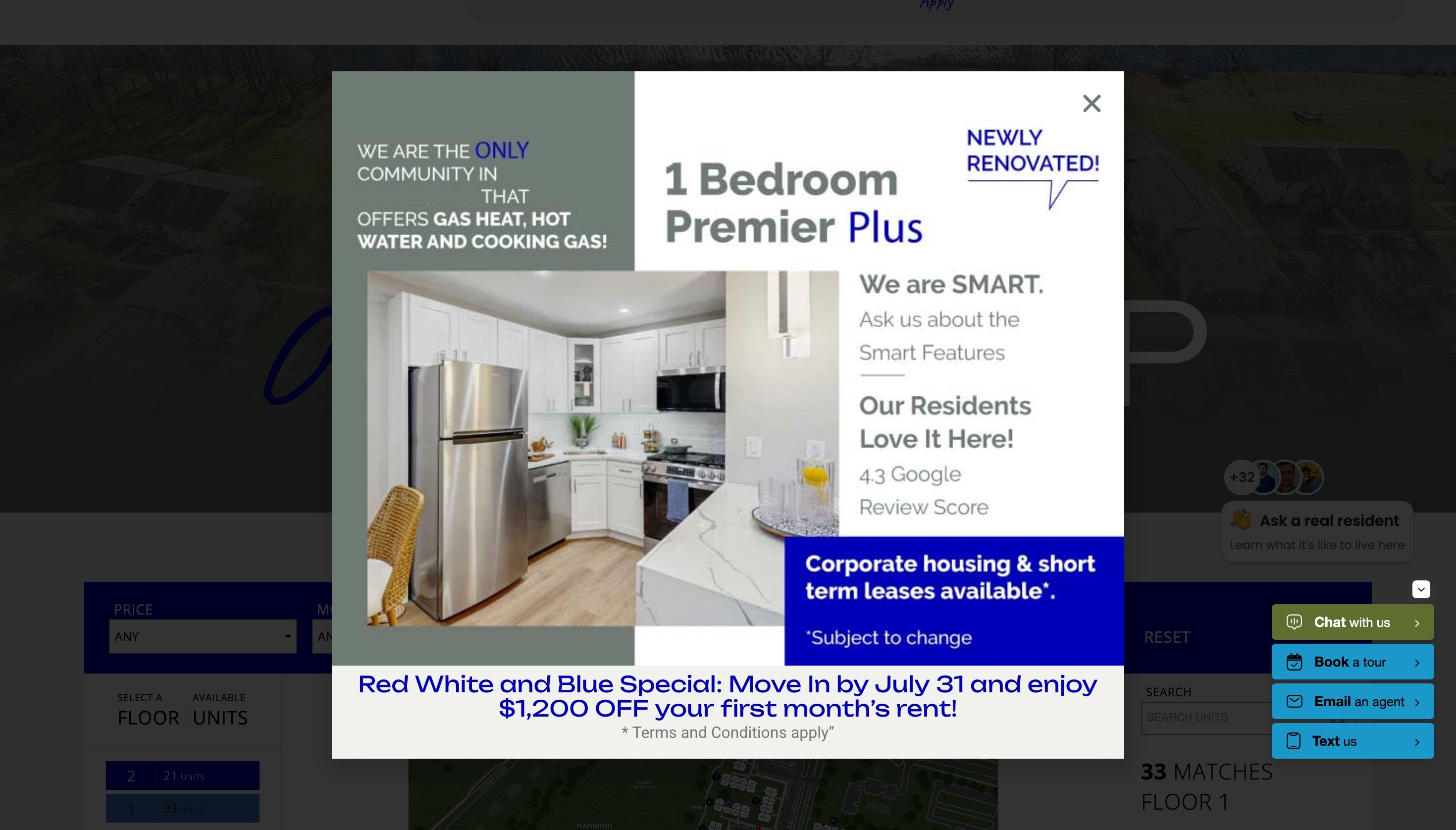
I rehearse all this because I spend my days inside an industry whose prevailing house style is the opposite conclusion. There are operators whose sites are quiet, confident and unhurried, and this essay is in large part an argument for copying them. But open enough apartment marketing websites, and you will find the cube’s exact negation: a popup that arrives before the hero image has loaded, a chat window waving hello, a second chat offering to introduce you to a Real Resident, a modal announcing a special as though you had won something. Any one of them can be defended. Arriving together, they address a visitor who has asked for nothing as though she had asked for everything. A confession is owed before I go further, since I sell property websites for a living and have built my share of the pages I am about to complain about. What follows belongs to the awkward genre of the arsonist lecturing on fire safety.
Respect is a conversion metric, and for a premium property that means the calmest website in the market will, over time, out-lease the loudest one. Beneath that claim sits a second one, that the luxury industry has always sold belonging, and that belonging, like love in Corneille, is precisely the thing one cannot shout.
Glamour is the happiness of being envied
The art critic John Berger gave the last essay of Ways of Seeing to publicity, and his argument fits in a sentence: ‘The happiness of being envied is glamour.’5 Publicity never sells the object. It sells the buyer an improved version of herself, seen through the eyes of others. Applied to an apartment, a property website’s single job is to let the renter envy a future version of herself, the one who comes home through that lobby in the light for which the photographer waited three days. Envy of that self is what fills out a tour form voluntarily.
At eleven at night, scrolling your floor plans, she is trying on a daydream to see whether it fits. A page that interrupts the daydream to demand her phone number has misunderstood its own product at the deepest level available to it.
Why you have a website at all
The renter’s default is not your website. It is Zillow, Apartments.com and Apartment List, products that are fast, comprehensive, honestly built and very good at what they do, and the most efficient way yet devised to compare one apartment against forty others. A property site offering a grid of units, a filter bar and a contact form is competing with that on its own ground, with one building, and it will lose. It is a worse Apartments.com with less inventory.
So what is your site for? Taking a side, precisely the thing an aggregator structurally cannot do. The appearance of neutrality is the aggregator’s entire product, and the moment it starts wanting you to choose the building on the left it stops being an instrument and becomes an advertisement. Comparison sets a thing beside its rivals and asks which is cheaper, which is nearer, which has the dishwasher. Fifteen imperatives shouting LEASE NOW do not answer that, because envy, unlike traffic, cannot be bought.
Your own site is the only surface in the funnel permitted to be in love with the building, and that is the whole of your structural advantage. She arrives having already seen four buildings in a list, and the single difference is that she is now standing in a doorway rather than a corridor of doors.
That difference is what the website budget has to buy. If your site produces no wanting that the listing did not already produce, it has cost money to be worse than a free listing, and the honest move would be to admit the aggregator was doing the work and stop paying for the website. The ordinary building feels this first, quietly demoted by the internet to a listing, a nowhere with a rent roll.
The four percent
I have drawn versions of this chart myself. Somebody shows an operator a slide: we added the popup and the auto-chat, and clicks on Lease Now rose four percent. Everyone toasts the four percent.
The chart is not lying. Lying would at least imply a residual respect for the truth it inverts. The chart is doing what Harry Frankfurt taught us to call, with full philosophical precision, bullshit: speech produced with indifference to how things actually are, because the meeting required a number.6
The dashboard counts the sliver of the market most willing to be shouted at. It omits the other ninety-six percent, the qualified reader who understood within one screen exactly what kind of operator was speaking and left without generating an event. There is no analytics event for felt insulted. So the experience drifts, sprint by well-intentioned sprint, toward the preferences of whoever clicks most, which is not the population that signs leases, and if your measurement cannot see the visitor who left in disgust, it will keep recommending whatever disgusted her.
An assistant that answers a question at midnight is useful, and the companies building them are good at what they do. The fault is execution and timing, everything arriving at the door at once rather than waiting for the moment it is wanted. And where a site has nothing of its own to show, the add-ons stop being a layer on the property site and become the property site, at which point it is fair to ask what the custom build was for.
The handbag is a membership card
Baudrillard’s argument in Le Système des objets is that past a certain price an object’s use dissolves into what it signifies, and what it signifies is membership.7 The monogram is a passport stamp, and the handbag a membership card that happens to hold keys.
Which exposes the strange advantage the multifamily industry holds and almost never notices. Fashion can only sell the sign of belonging. An apartment is where the life happens: an address, a set of keys, a floor she will come to recognize blindfolded by the sound of the lift. Luxury marketing spends billions simulating what a leasing office hands over with a fob. No handbag can compete with a front door, and it is perverse that the websites selling front doors have taken from the handbag houses everything but their restraint.
The properties getting this right happen to sit at the top of the market, but that is an accident of budget rather than taste. Already desired, the luxury tower barely needs the help. It is the ordinary building, the walk-up on an unremarkable street, that a site can transform.
The anthropologist Marc Augé gave that nowhere a name. Non-lieux are spaces with no identity, no relations and no history: the airport corridor, the motorway service station.8 The template property site, with its interchangeable furniture and its stock photograph of two people laughing near a worktop, is a non-place in the strict anthropological sense, and selling a place is the one job a non-place cannot do. You cannot persuade someone she belongs somewhere by greeting her from nowhere.
Hospitality, or the form at the door
If what you sell is belonging, then the website is the building’s first threshold, and thresholds are where hospitality is decided. In De l’hospitalité Derrida distinguished conditional from unconditional hospitality: the unconditional kind welcomes the stranger before asking her name, the conditional kind interrogates at the threshold.9 Now consider the pricing page that answers the renter’s only question with a form demanding name, phone and desired move-in date. The industry calls this lead capture. It is a checkpoint bolted to the door of a building whose business is, literally, hospitality. The word was a clue, and in several states it is now also a compliance question.
At Foreword we say we build for clients who would rather be read than merely found. Barthes set the standard higher than any brand guideline ever has:10
The text you write must prove to me that it desires me.
A website is a text. Most property websites prove only that they desire your email address, which is not the same thing, as anyone who has been on a bad date can confirm. Here the litote earns its keep in commerce. Say less, and the reader completes the page with her own desire, which was always the only engine available. It is the same economy by which Chimène never says I love you and Apple keeps its products out of the window.
Four tests you can run this afternoon
Open your own property’s site and try these.
The subtraction test. Put your hand over the popups, the counters and the chat bubbles, and study what remains. If what is left could as easily move a hospital bed, a used sedan or a warehouse developer’s pre-leases on a slab, then the widgets were doing all the wanting, badly, over nothing in particular.
The four-second test. Load the homepage, count to four, then look away and ask what the page just told you about the people who run this building. That impression is formed well before a single fact has been read, and it is the one your dashboard has no column for.
The stranger test. Try to find out what a two-bedroom costs without giving anyone your name. If you cannot, you have a checkpoint, not a threshold. Time how long it takes. Then consider that a renter with four tabs open gives you rather less patience than you just gave yourself.
The daydream test. Find the single sentence on the site that describes what living there is like: the light at four o’clock, the walk to the station, the thing residents do on Sunday. If there is no such sentence, the site is selling amenities, and amenities are a specification.
What respect looks like in practice
- One honest number. Show real pricing as plain text, ideally all-in, rather than a base rent no lease will ever say. Hospitality begins before the name is asked, and a price is the first hospitality a website can offer.
- One live page, not two tabs. Let the prospect stroll the map and the floor plans as one experience rather than splitting them across tabs that never share data. Wandering, doubling back and lingering on a corner unit is how a renter starts to occupy a place before she signs for it.
- Chat on summons, never on arrival. The same window that reads as a mousetrap when it opens unbidden reads as a concierge when it waits to be called.
- Editorial pacing. White space, real photography and a paragraph worth reading slow a visitor down long enough to want the place.
- Sound like somewhere. Name the street, the light, the neighborhood ritual.
- One confident invitation. Place a clear way to tour where a decided renter will look for it, then trust her to use it. A renter who has made up her mind should never have to hunt.
- No manufactured scarcity. No countdown on an apartment, no exit popup that guilts, no six people are viewing this now. It is a nervous tic rather than a sin, a site clearing its throat before it asks for the deposit. But an honestly wired site already knows what the rent roll says is available, so the countdown is a cheap forgery of a fact it was holding all along.
- Publish what you charge. The same nerve applies to your own vendors. We put our prices in public for the same reason we think you should put yours there, because a number you have to ask for is a number that has already cost the asker something.
- Legible to machines, for the same reason. One true price in plain text, availability the site can stand behind, facts an AI assistant can quote accurately. Respect for the reader and legibility for the crawler are one craft pointed in two directions. Being read is the goal. Being found is how the right reader arrives.
The short version
- Say less. Understatement conscripts the reader’s desire to complete it.
- The listing sites are good, which is the point. They compare, and comparison is the enemy of desire. Yours is the only surface allowed to take a side. If it produces no wanting the listing did not, it cost money to be worse than a free listing.
- The four percent is bullshit in the technical sense. If your measurement cannot see the reader who left, it will keep recommending whatever drove her off.
- Luxury sells belonging, and you sell the real thing. An apartment is not the sign of a life, it is the address of one. Do not sell a place from a non-place.
- A site must prove it desires its reader. Then the reader tours.
Nearly every building speaks at the same volume through the same borrowed instruments. The dignity is already in the buildings, and the websites keep letting them down. Yours could be a floor plan, one true number and a door. It is of course preposterous to close a sales argument by invoking Roland Barthes and a glass pyramid, and I have done it anyway. The reader is invited to hold this against me at her leisure. If you would like to see what restraint looks like on your own property, get in touch. I promise not to shout.
Notes
- Byung-Chul Han reads the Fifth Avenue store, transparent and for years open at every hour, as the temple of the transparency society: Psychopolitik: Neoliberalismus und die neuen Machttechniken (2014). The temple, unusually, turned a profit. ↩
- Pei’s pyramid, commissioned by François Mitterrand and opened in 1989 to polemics that ran from sacrilege to Disneyland, now appears on the museum’s own tickets. Apple went on to open a store inside the Carrousel du Louvre in November 2009, a few steps from Pei’s inverted pyramid: commerce did not borrow the museum’s clothes so much as move into its basement. ↩
- Robert Bresson, Notes sur le cinématographe (Paris: Gallimard, 1975). Bresson also forbade his actors to act. ↩
- Pierre Corneille, Le Cid (1637), III, 4. The schoolbooks call it litote. Chimène’s line has been converting readers since 1637, a retention curve no call-to-action has matched. ↩
- John Berger, Ways of Seeing (London: BBC and Penguin, 1972). The book began as four half-hour television programs, which is roughly the attention budget of a modern homepage visit. ↩
- Harry G. Frankfurt, On Bullshit (Princeton: Princeton University Press, 2005). The liar knows the truth and negates it; the bullshitter is simply indifferent to it. Frankfurt’s essay is twenty pages long and explains most meetings. ↩
- Jean Baudrillard, Le Système des objets (Paris: Gallimard, 1968); see also La Société de consommation (Paris: Denoël, 1970). Baudrillard later doubted that the Gulf War had taken place. He never doubted the handbag. ↩
- Marc Augé, Non-lieux. Introduction à une anthropologie de la surmodernité (Paris: Seuil, 1992). His examples are airports, motorways and hotel chains. The list was never intended to be exhaustive. ↩
- Jacques Derrida et Anne Dufourmantelle, De l’hospitalité (Paris: Calmann-Lévy, 1997). Unconditional hospitality welcomes the guest before asking her name. Conditional hospitality has a required field. ↩
- Roland Barthes, Le Plaisir du texte (Paris: Seuil, 1973): ‘Le texte que vous écrivez doit me donner la preuve qu’il me désire.’ Barthes distinguished texts of pleasure from texts of bliss. Property websites have largely opted for a third category. ↩
See your property on WP FloorMap
Send a SightMap link, and we reply with a working preview of your site within 12 hours.